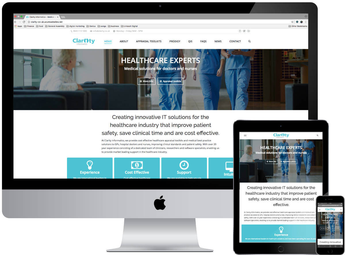
About Project
Client: Clarity Informatics
Subject: Website re-design and strategy
Clarity Informatics are leading healthcare experts in providing medical solutions for GPs, hospital doctors and nurses, and are No.1 providers for appraisal and revalidation toolkits. With growing competition from other appraisal toolkit providers, and a legal requirement for doctors and nurses to be appraised every three years, Clarity wanted a website that confirms their leading market position.
Our Task Was
Create a responsive website that’s visually strong and engaging, whilst encouraging users through the online journey for sales enquiries. Furthermore the website needs simple navigation as it additionally accommodates online appraisal procedures, therefore logging into an existing backend membership area needed to be seamless.
What We’ve Done
- A full audit of Clarity’s existing website, including heat mapping technology to understand existing online user behaviour.
- A competitor analysis and their strengths and weaknesses.
- Strategy planning meeting to ascertain what the new website should be, understanding all the key needs and requirements.
- Site map and page structure revision to provide simple user navigation.
- Imagery sourcing to create the appropriate online environment, with the recommendation in focusing on the ‘human touch’ of medical services.
- Stronger and better placed call to actions to encourage enquiries, in addition to introducing ‘request a quote’ form areas for easy enquiry completion.
- Newly added areas such as FAQs to better support the user ‘research’ journey, and reduce admin.
- News template for the client to continue news updates post launch.
Result
- Significant improvement in brand perceptions after receiving much feedback.
- Bounce rate reduced by over 30%.
Client Says
As customers frequently log onto our website for appraisal toolkits, it was so important to address key issues with the online user journey and visual design territory. The new website is really clean, clear and easy to navigate – we’re extremely pleased with the results!

